For my EDA Insem 2, sir drew three acronyms on the board (MCAR, MAR, MNAR) and four plots from a library called missingno (bar, matrix, heatmap, dendrogram). So I did the obvious thing: ran all four on a dataset and waited for one of them to tell me which mechanism I had.
None of them did. Not because the plots are bad, but because of one line of notation that, once you see it, tells you exactly what each plot can and cannot do. This post is that line, four annotated plots, and the detective routine I use now.
The one idea: missingno only ever sees R
Every dataset with holes is secretly two tables. There is Y, the complete data you wish you had, which splits into the part you observed (Y_obs) and the part hiding behind the blanks (Y_mis). And there is R, a grid of the same shape that just says 1 if a cell was observed and 0 if it was missing. In pandas, R is df.notnull().
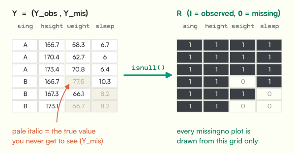
Donald Rubin’s 1976 paper sorts every missing-data problem by what R depends on:
- MCAR (missing completely at random):
Rdepends on nothing.P(R | Y_obs, Y_mis) = P(R). - MAR (missing at random):
Rdepends only on things you did observe.P(R | Y_obs, Y_mis) = P(R | Y_obs). - MNAR (missing not at random):
Rdepends on the missing values themselves, and the equation refuses to simplify.
Now the key move. All four missingno plots are computed from R and nothing else. So:
- They can show you structure inside R (which columns go missing together).
- If you sort the rows by an observed column first, they can hint at a link between R and Y_obs. That is MAR’s signature.
- They can never show a link between R and Y_mis, because
Y_misis the one thing nobody has. That is MNAR’s signature, and it is invisible by construction.
Keep that in your pocket. Every plot below is just this idea applied once.
The hostel weighing machine
To check the plots against the truth, I need data where I know the truth. So I simulated it. The setup is borrowed from Stef van Buuren’s book Flexible Imputation of Missing Data, which explains all three mechanisms with one weighing scale. Mine lives in a hostel.
300 students, columns age, wing, height, weight, bmi, steps, sleep, mess_rating. A few holes are the same in every version: steps drops 12% at random (the phone app fails to sync), and sleep plus mess_rating come from one evening form that 18% of students never submit. Then I made three copies where weight goes missing in three different ways:
- MCAR: the scale’s battery dies at random moments.
- MAR: the scale in wing B sits on a carpet and keeps failing.
wingis recorded. - MNAR: heavier students quietly skip the scale.
bmi is computed from weight, so it vanishes with it. All three copies lose 23 to 24% of their weights, so any difference in the plots comes from the mechanism and nothing else.
Plot 1: msno.bar, the thermometer
msno.bar(df) draws one bar per column: how many rows are not missing. That’s df.notnull().sum(), nothing more.
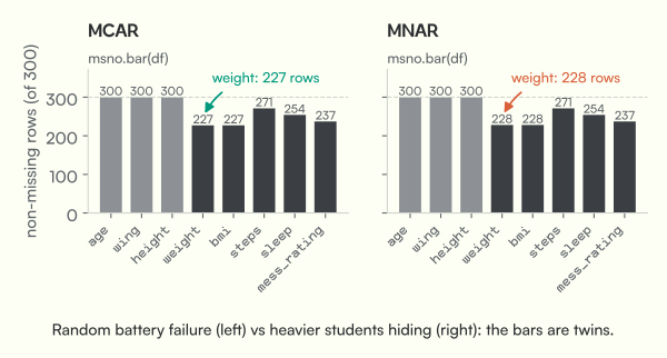
It answers “how much is missing?” beautifully and “why?” not at all. A random battery failure and heavy students hiding produce twin bars, 227 vs 228 weights. The bar is a thermometer, not a diagnosis. I still run it first, every time, because “how much” decides whether you are cleaning a few cells or rescuing a column.
Plot 2: msno.matrix, R itself
msno.matrix(df) is the most honest plot of the four: it is R, drawn as a picture. Dark means data, pale means missing, one horizontal line per row.
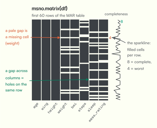
The trick nobody tells you: the row order is your choice, and it changes everything. The rows come in file order, which is usually arbitrary. If missingness depends on some observed column, sort by that column first and the holes will line up. That’s MAR becoming visible.
import missingno as msno
msno.matrix(df.sort_values("wing"))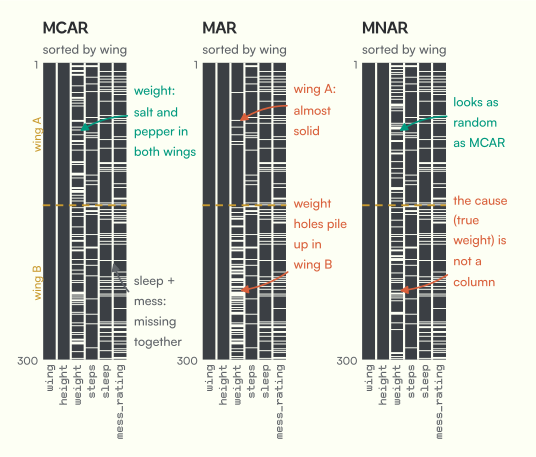
Look at the middle panel: wing A is almost solid, wing B is full of holes. That’s the carpet, sitting right there in the picture. Notice two other things. The sleep and mess_rating gaps line up row for row in every panel (that evening form). And the MNAR panel on the right looks exactly as innocent as MCAR.
The one that bit me: MNAR wears an MCAR costume
I kept sorting the MNAR table by every column, hoping a band would appear. Here is what happened.
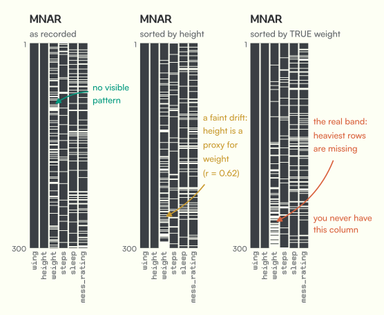
Sorted by height, there is a faint drift towards the bottom, because tall students tend to be heavy and so leak a little of the truth. Sorted by the true weight, the band is unmistakable. But in real life that third panel does not exist. The cause of MNAR missingness is the very value you lost. Of course you can’t sort by it.
Plot 3: msno.heatmap, which columns go missing together
msno.heatmap(df) takes each column’s missing indicator (1 if the cell is missing, 0 if not) and correlates them pairwise. For two 0/1 columns, that Pearson r is the phi coefficient. It answers: when this column is missing, is that one missing too?
I read the library’s source to get the details right, because the picture hides some decisions:
- Columns that are never missing (or always missing) are dropped. They have zero variance, so no correlation exists.
- Only the lower triangle is drawn.
- Any |r| below 0.05 is shown as a blank cell, values from 0.95 up to (but not including) 1 show as
<1, and everything else is rounded to one decimal.
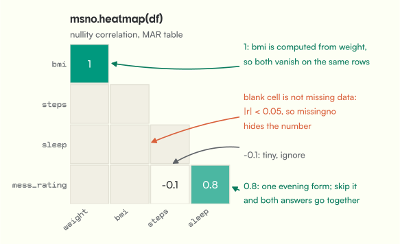
The heatmap is great at finding shared causes of holes. bmi vs weight is 1 because one is computed from the other. sleep vs mess_rating is 0.8 because they come from the same form (not 1, because 17 students submitted the form but skipped one question). Everything else is blank, meaning unrelated.
What it can’t do: say anything about MAR in the sense Rubin meant it. The carpet effect is a link between weight’s holes and the values of wing. Since wing is never missing, the heatmap drops it entirely. A near-blank heatmap is not a certificate of MCAR.
Plot 4: msno.dendrogram, the same idea at scale
With 8 columns the heatmap is readable. With 80 it isn’t, so missingno also clusters the columns. Under the hood it is one SciPy call: hierarchical clustering with average linkage on the transposed 0/1 matrix, using Euclidean distance.
That makes the y-axis surprisingly concrete. For two 0/1 columns, the Euclidean distance is sqrt(number of rows where exactly one of them is missing).
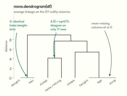
Read it bottom-up: the lower two columns join, the more alike their holes. Same strengths and same blind spot as the heatmap, because it’s the same information, just clustered.
So how do you actually tell them apart?
Here is the move that works. Stop staring at R alone and split every observed column by whether the target column is missing. If the people with holes look different on anything you can see, the holes are not completely random.
- Categorical column: compare missing rates across groups (chi-square test).
- Numeric column: compare the two distributions (a t-test, or just overlapping histograms).
- Everything at once: Little’s MCAR test (1988), which checks whether the column means differ across missingness patterns.
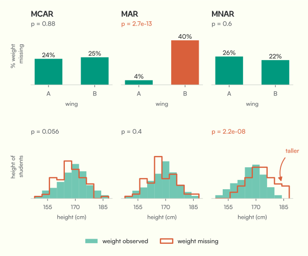
MAR gets caught by wing (4% vs 40% missing, p = 2.7e-13). And look at MNAR: the wing test passes, but the students whose weight is missing are clearly taller (p = 2.2e-08). Height is the proxy leaking the truth. Little’s test on height, weight, wing and steps says the same thing:
| table | Little’s chi-square | p-value | verdict |
|---|---|---|---|
| MCAR | 4.1 (df 8) | 0.84 | no evidence against MCAR |
| MAR | 57.1 (df 8) | 1.7e-09 | not MCAR |
| MNAR | 38.4 (df 8) | 6.4e-06 | not MCAR |
Read the last row twice. The test caught MNAR, but it can only ever say “not MCAR”. It has no way to tell you whether that’s the carpet kind (MAR) or the self-hiding kind (MNAR). And it only caught it because height happened to be correlated with weight. Drop height from Little’s test and MNAR sails through with p = 0.55.
Try it yourself. This runs real Python in your browser (the first run takes a few seconds to load pandas and SciPy). Your numbers will differ slightly from the figures, but the pattern won’t:
Change the 2.2 in the MNAR line to 0 and watch it turn into MCAR. Change 0.45 to 0.05 and the carpet stops mattering.
The part no plot can do
Here’s why all of this matters, drawn with the one thing you never get in real life: the full truth.
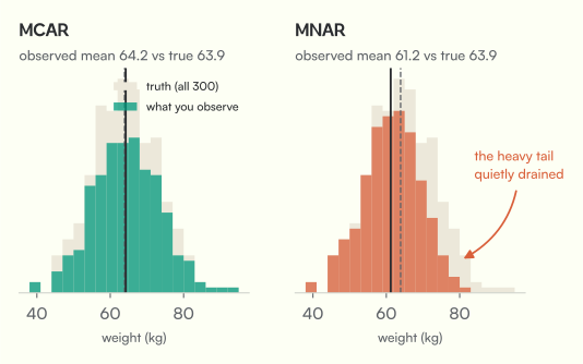
Under MCAR, deleting the holes just costs precision. Under MNAR, every average, correlation and model built on the observed rows is quietly wrong, and nothing in the data tells you. van Buuren’s advice for MNAR is the honest one: go find out why values are missing (ask whoever collected the data), and run what-if analyses. For example: if the missing students were 5 kg heavier on average, does my conclusion survive?
My routine now
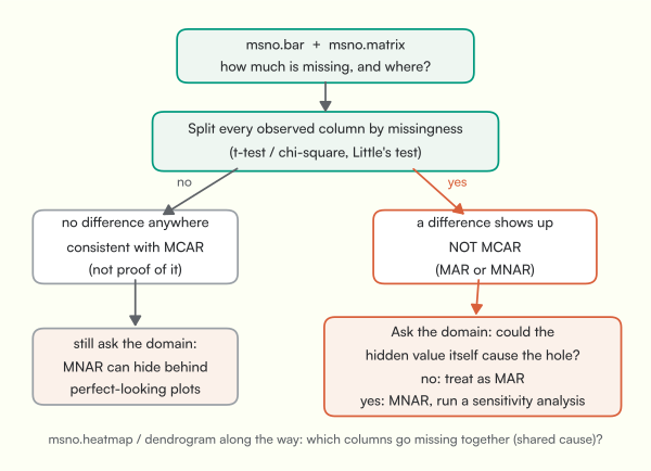
msno.barfor how much,msno.matrixfor where. Sort the matrix by every column you suspect.msno.heatmap/msno.dendrogramto find columns that share a cause (same form, same sensor, derived columns).- Split every observed column by missingness, then run Little’s test. A difference means not MCAR.
- Ask the human question every time, even when everything passes: could the value itself be the reason it’s missing?
The mental model I keep: missingno draws R. MCAR and MAR leave fingerprints on R plus the columns you have. MNAR leaves its fingerprints on a column you lost. Plots can find the first two. Only thinking finds the third.
If you’d rather watch
I looked for one video that covers all four plots and the three mechanisms properly. It doesn’t exist (part of why this post does). These four together cover it:
- Missingno Python library by Andy McDonald: bar, matrix, heatmap and dendrogram on real well-log data.
- Missing data mechanisms by Mikko Rönkkö (Aalto University): the clearest ten minutes on Rubin’s three cases I’ve found.
- Statistical modeling and missing data by Rod Little, at the Institute for Advanced Study. Yes, that Little.
- The Future of Missing Data by Nicholas Tierney (author of R’s naniar), on exploring missingness alongside the data, not in isolation.
Sources
- D. B. Rubin (1976). Inference and missing data. Biometrika 63(3), 581 to 592.
- R. J. A. Little (1988). A test of missing completely at random for multivariate data with missing values. JASA 83(404), 1198 to 1202.
- S. van Buuren (2018). Flexible Imputation of Missing Data, 2nd ed., sections 1.2 and 4.1.
- A. Bilogur (2018). Missingno: a missing data visualization suite. JOSS 3(22), 547. Plus the missingno source, for the heatmap labelling rules and the dendrogram’s linkage.
- N. Tierney and D. Cook (2023). Expanding tidy data principles to facilitate missing data exploration, visualization and assessment of imputations. JSS 105(7).
Every figure here comes from one simulated dataset (seed 26), so the truth is known and every number is checkable.
Next time: what to actually do once you know the mechanism. Deletion, mean imputation, and why the second one quietly shrinks your variance.